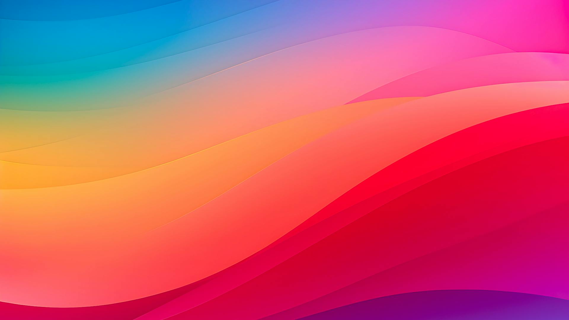
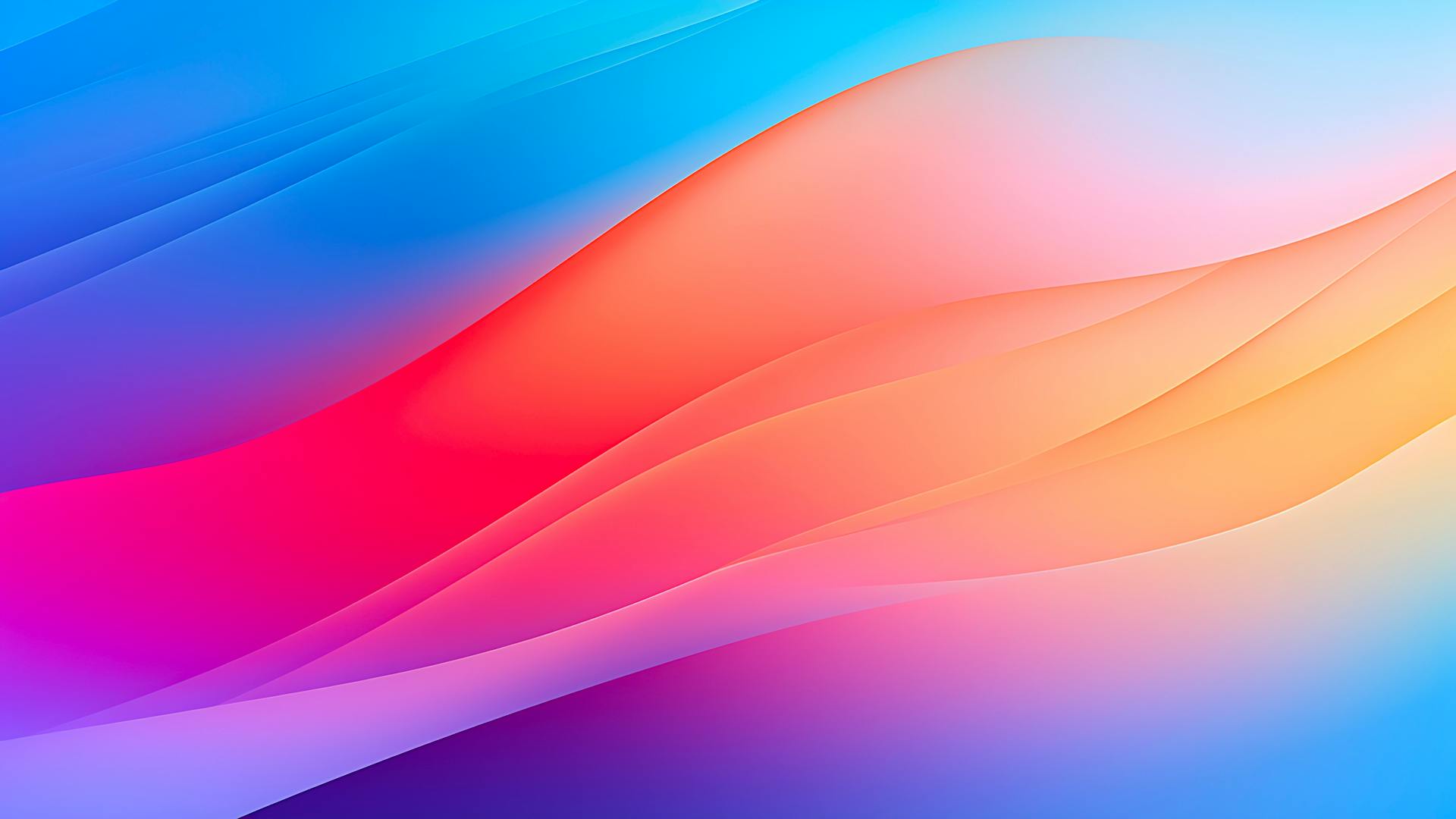
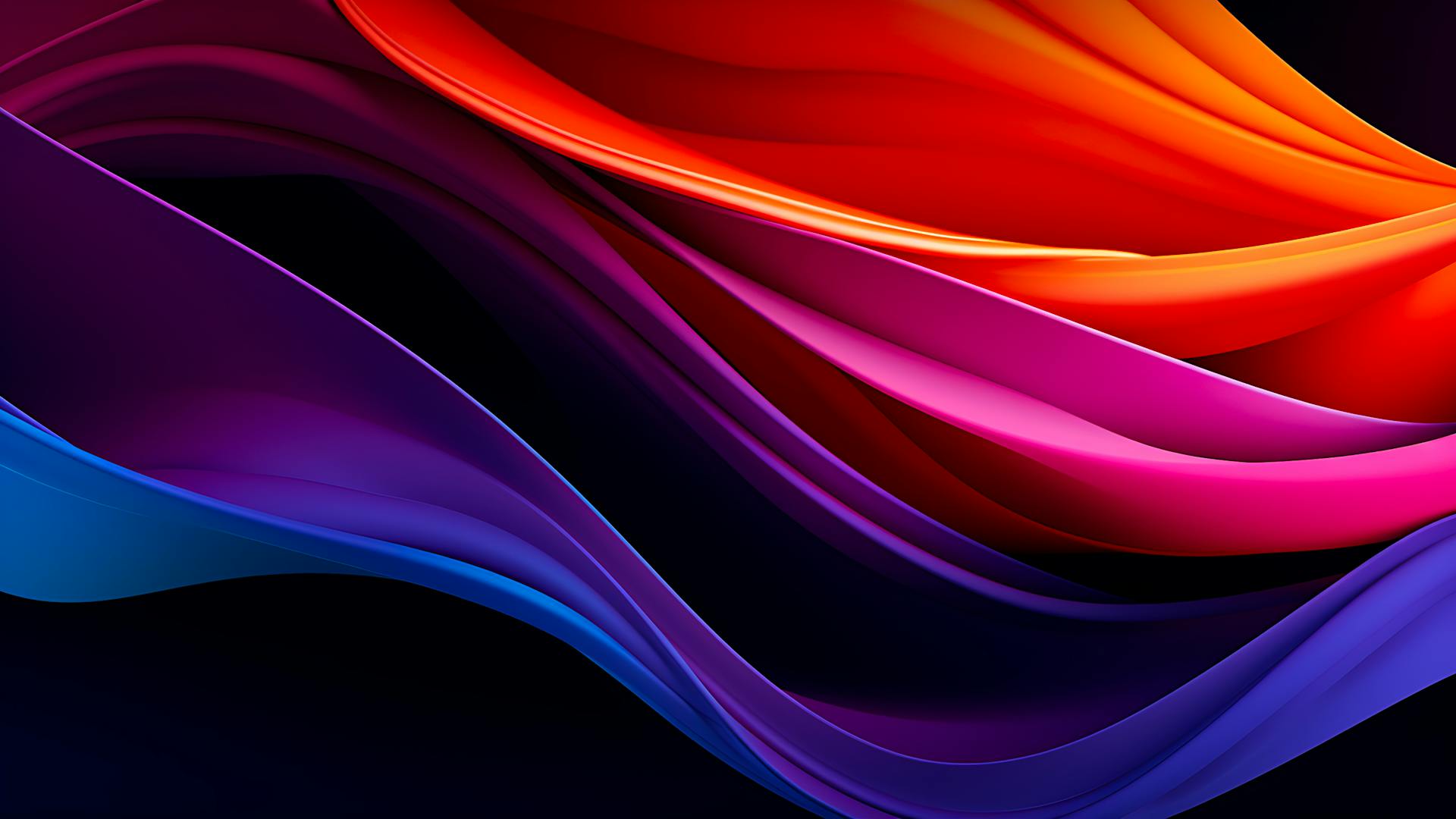
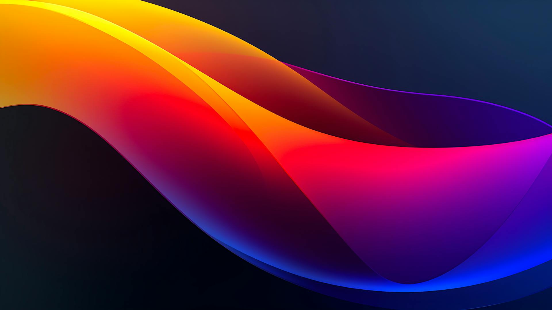
User Interface (UI) gradients have become an increasingly popular design trend in recent years, and for good reason. They provide a unique and visually appealing way to enhance the look and feel of various UI elements, from buttons to backgrounds. In this article, we'll explore the different types of gradients, the importance of using them effectively, and some tips for creating your own custom gradients.
Types of UI Gradients
- Linear Gradients: The most common type of gradient, linear gradients transition smoothly from one color to another along a straight line. This can be horizontal, vertical, or diagonal, depending on the desired effect.
- Radial Gradient: Radial gradients are circular in shape, with colors transitioning outwards from a central focal point. This creates a more dynamic and eye-catching effect, particularly when used for wallpaper backgrounds.
- Angular Gradient: Also known as conic gradients, angular gradients transition colors along a circular path, with each color stop forming a distinct wedge shape. This can result in a unique, pie-chart-like effect.
- Mesh Gradients: A more complex type of gradient, mesh gradients involve multiple colors and points of transition, allowing for an even more intricate and detailed effect.
- Conical Gradients: Conical gradients are similar to angular gradients, but they transition colors along a circular path instead of a straight line. This creates a more dynamic and eye-catching effect.
Importance of UI Gradients in Design
As any product designer or ui designer would say, UI gradients serve several purposes in design, including:
- Drawing the user's attention to specific elements in the best way, such as action buttons or important information.
- Creating a unique and visually appealing effect, which can help to set your website or app apart from the competition for a long time.
- Establishing a consistent color theme throughout your design, ensuring a cohesive and professional look.
- Providing a smooth transition between colors, which can be more visually pleasing than a solid color.
Tips for Creating Effective Gradients
- Choose the Right Colors: The colors you choose for your gradient will have a significant impact on the overall look and feel of your design. Consider using a color wheel to help you select complementary or analogous colors that work well together.
- Use Color Stops Wisely: Color stops are the points at which the gradient transitions from one color to another. By adjusting the position and spacing of these stops, you can create a more gradual or abrupt transition, depending on the desired effect.
- Experiment with Different Gradient Types: Don't be afraid to try out different types of gradients to see which one works best for your particular design. Each gradient type has its own unique characteristics and can be used to achieve different effects.
- Test Your Gradients on Multiple Devices: To ensure that your gradients look good on all devices and browsers, be sure to test them using cross-browser code and various screen sizes. This will help you identify any potential issues and make necessary adjustments.
- Use Adobe XD or Other Design Tools: Tools like Adobe XD, Figma, or Sketch can help you create and refine your gradients with ease. These programs offer a range of features and options that make it simple to experiment with different gradient styles and effects.
- Use a Gradient Generator: Like coolors.co or ours (click on any color above) are a great way to quickly create and test different gradients. These tools allow you to adjust the color stops, gradient type, and other settings to achieve the desired effect. Try
Creating Your Own Custom Gradient
If you're looking to create your own gradient, like CSS code, follow these steps:
- Choose your colors: Select the colors you'd like to include in your gradient. Remember to use a color wheel to help you find complementary or analogous colors that work well together.
- Choose the gradient type: Determine whether you'd like to create a linear, radial, angular, or mesh gradient, and adjust the settings accordingly.
- Adjust the color stops: Position the color stops along the gradient path, adjusting their spacing and positioning to achieve the desired transition effect.
- Experiment with different effects: Try adding a focal point, using a dark blue-to-blue gradient for added depth on a deeper level, or incorporating smooth transitions for a more subtle effect.
- Test your gradient: Once you're happy with your gradient, be sure to test it on multiple devices and browsers to ensure it looks good on every part of your website.
In Conclusion
Smooth gradients are a powerful design tool to add an unique effect that can enhance the appearance and functionality of your website or app. Like background elements or text gradients.
By understanding the different types of gradients and how to use them effectively, you can create a visually stunning and engaging user experience. Don't be afraid to experiment with different gradient styles and effects, and remember to always test your gradients on multiple devices to ensure they look great for all users.
